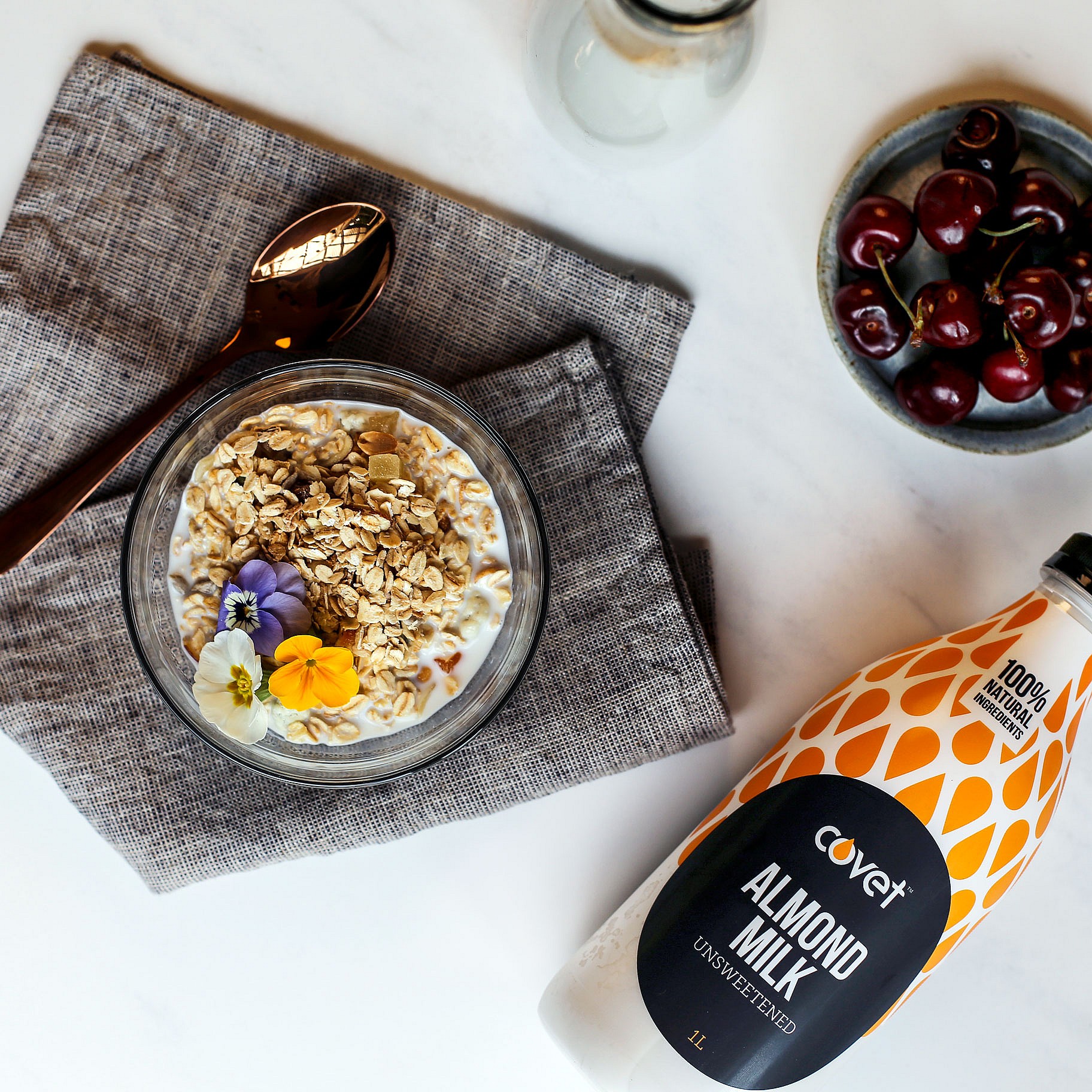
New Zealand nutrition brand Horleys came to us with a challenging brief: to create a brand identity and packaging design for Covet — their premium range of nut-based milks, ready for launch into a product category that was already full to bursting.
They wanted their product to embody a sense of natural calm and indulgence, and guilt-free enjoyment — a delicious, healthful product with a sleek and simple brand, not just another dairy alternative.
Solution
Unlike other non-dairy milks, Covet comes bottled in the chilled aisle. Set apart from its nut milk competitors, it’s positioned up against premium refrigerated dairy milk, and needs to stand out.
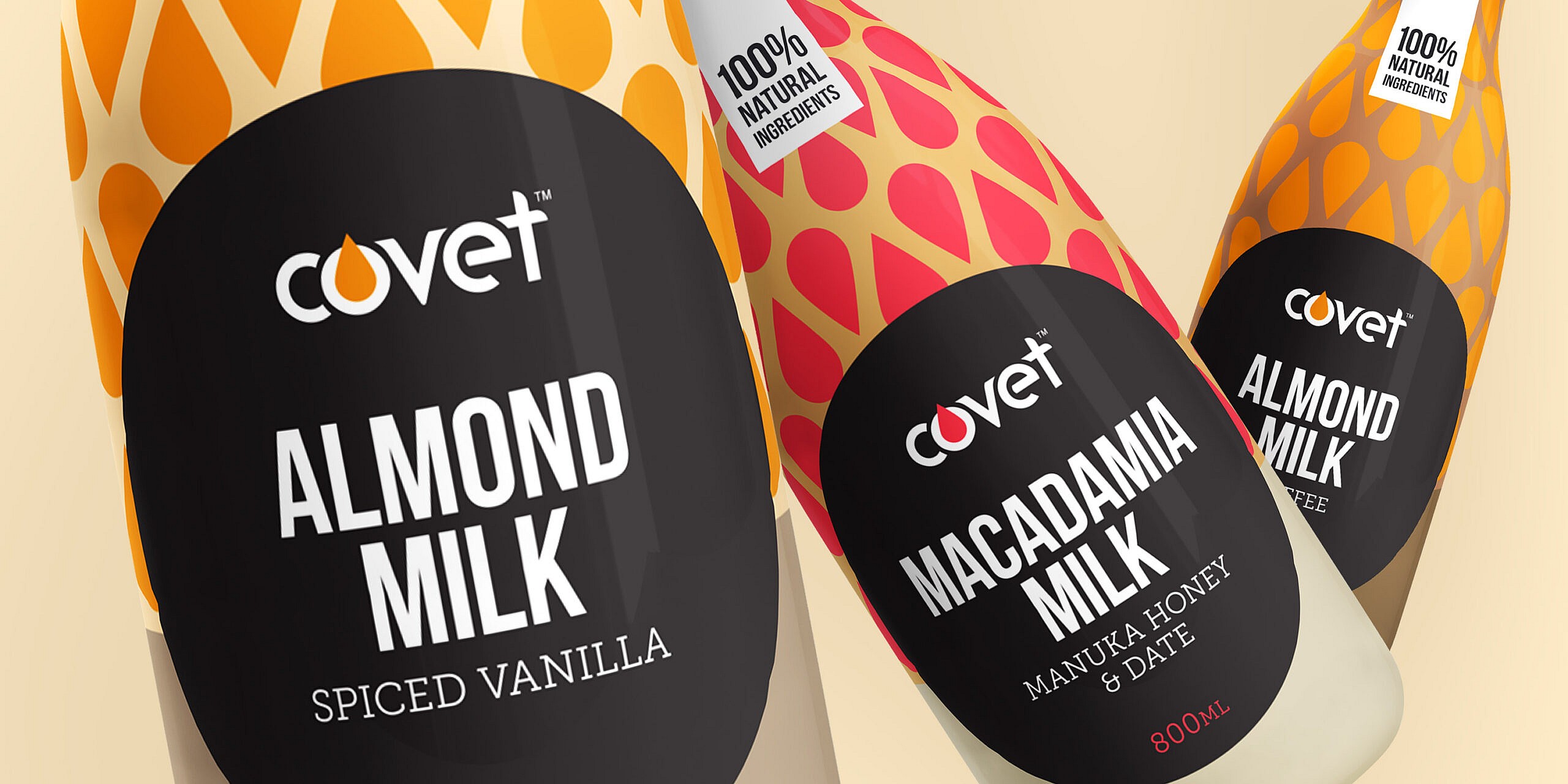
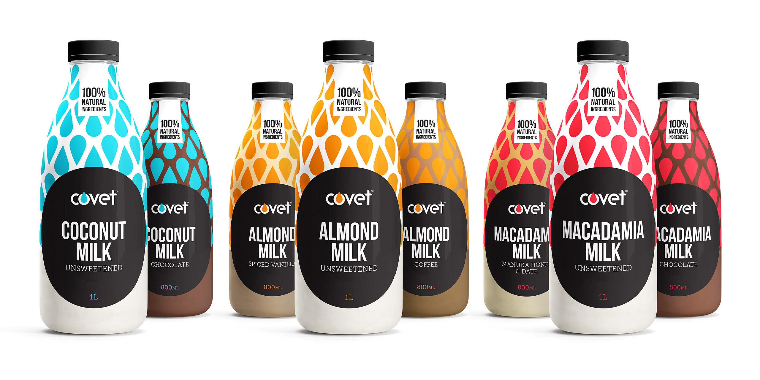
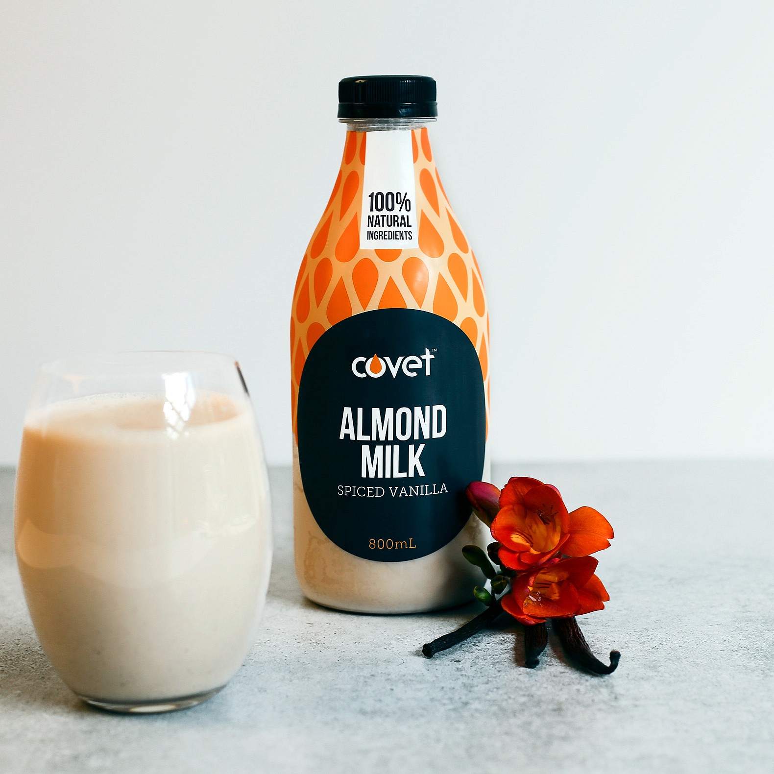
We gave Covet some clout with a pattern formed from a stylised nut motif, with each variant bearing its own vibrant colour for instant segmentation and recognisability — after all, how often have we heard, “the green one” when asked to grab some milk?
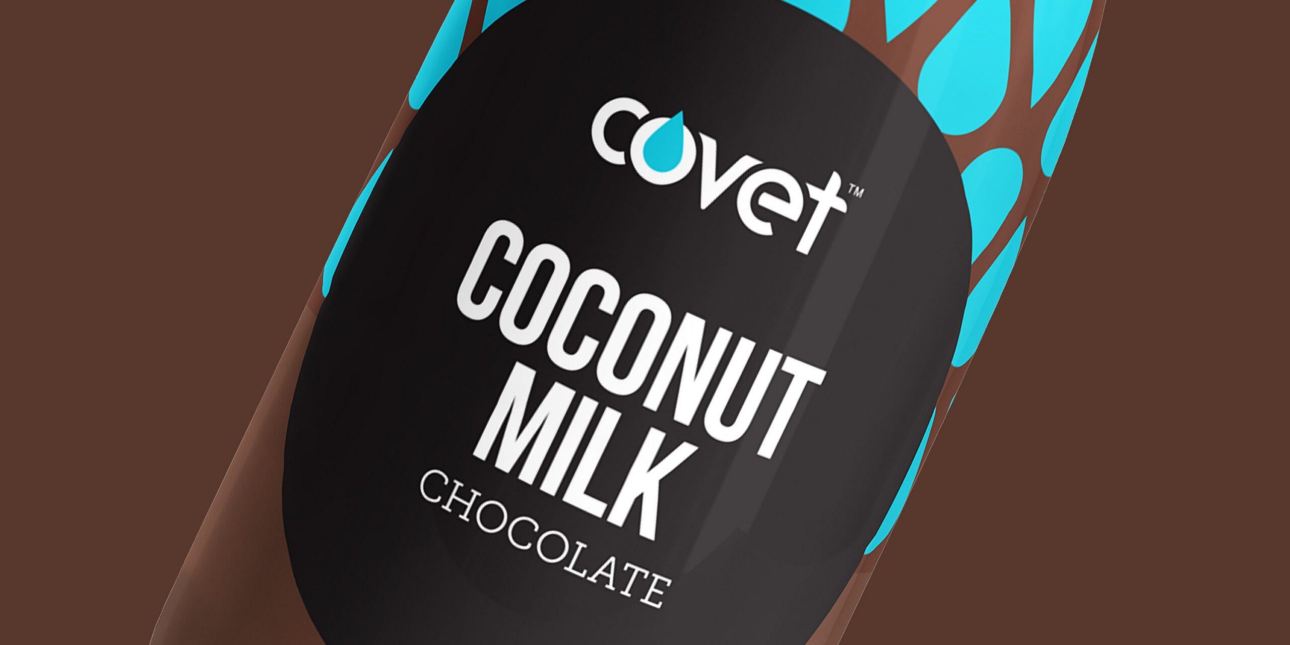
The packaging design’s dark and minimalist, a complete departure from the green and white pastoral chic of traditional milk labels, and a neat way to emphasise the lack of additives in Horleys products.
The variation name on each bottle overshadows the brand name — highlighting once again the overriding importance of the product’s delicious natural ingredients.