When Mars Wrigley’s Extra UK team decided to launch a new gum on the UK market, they needed a cohesive, standout brand that would capture the product’s benefits and refresh the public’s enthusiasm for gum.
We were brought on to develop a mouth-watering new brand identity, eye-catching packaging, and a raft of internal communications materials to serve as a practical and inspiring resource for the in-house team.
Solution
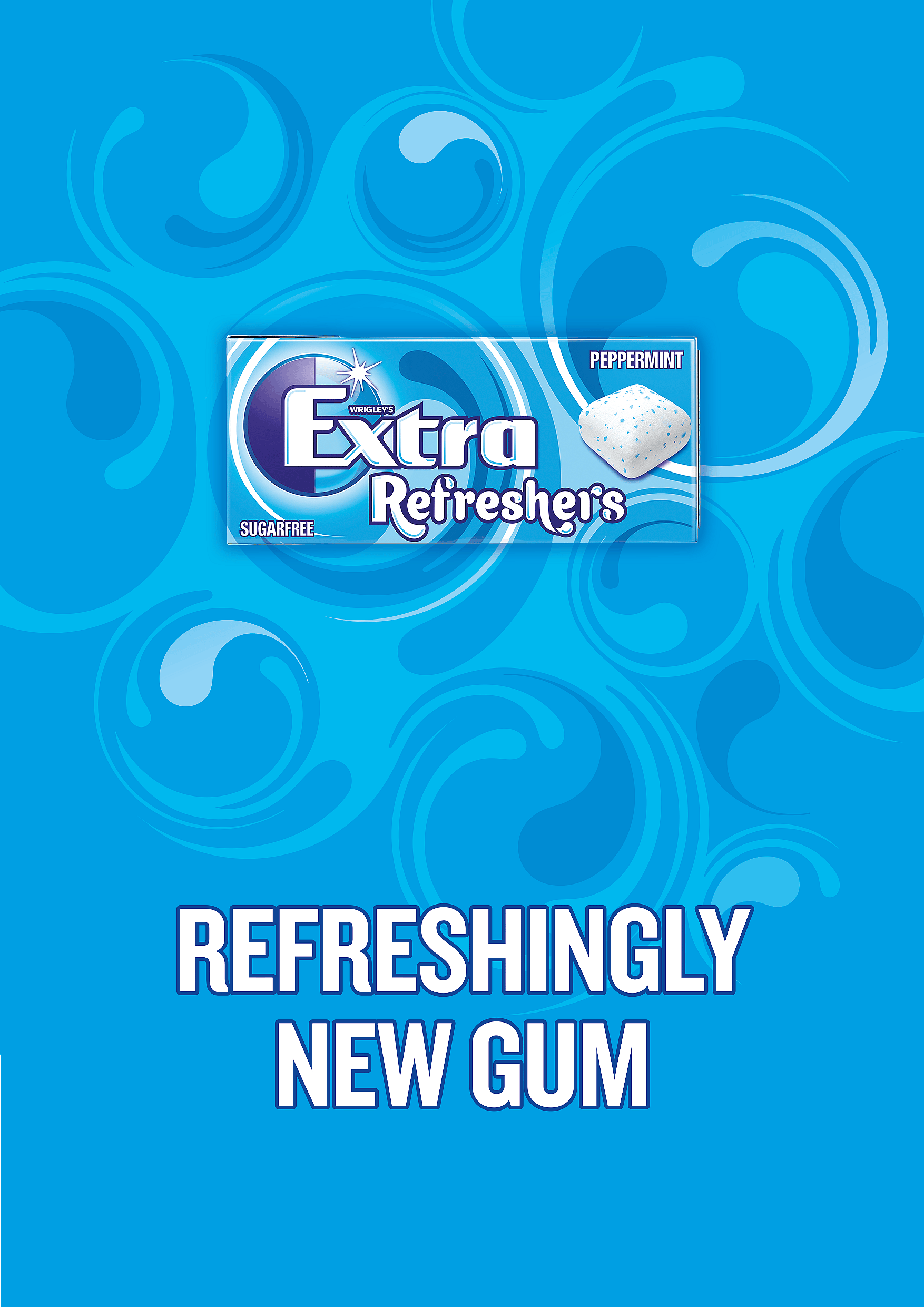
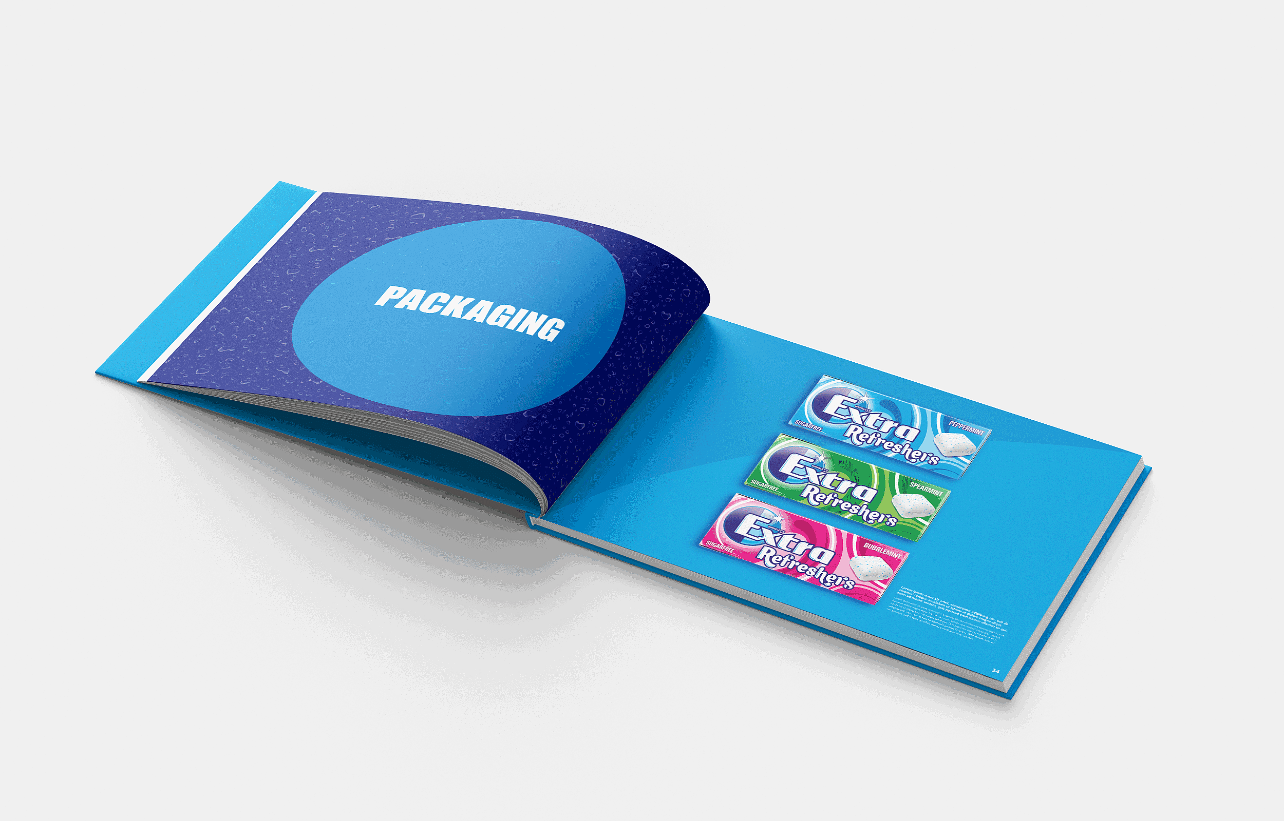
We used the instantly recognisable Extra brand mark as our starting point, and created a backdrop of fluid forms to communicate the hydrating freshness of the product. The ‘Refreshers’ logo gives a nod to the thirst-quenching effects of the gum — its font is reminiscent of water droplets.
Vibrant colours help the packaging stand out in a crowded market, while the design — distinct but closely related to the original Extra brand — leaves plenty of room for future portfolio expansion.
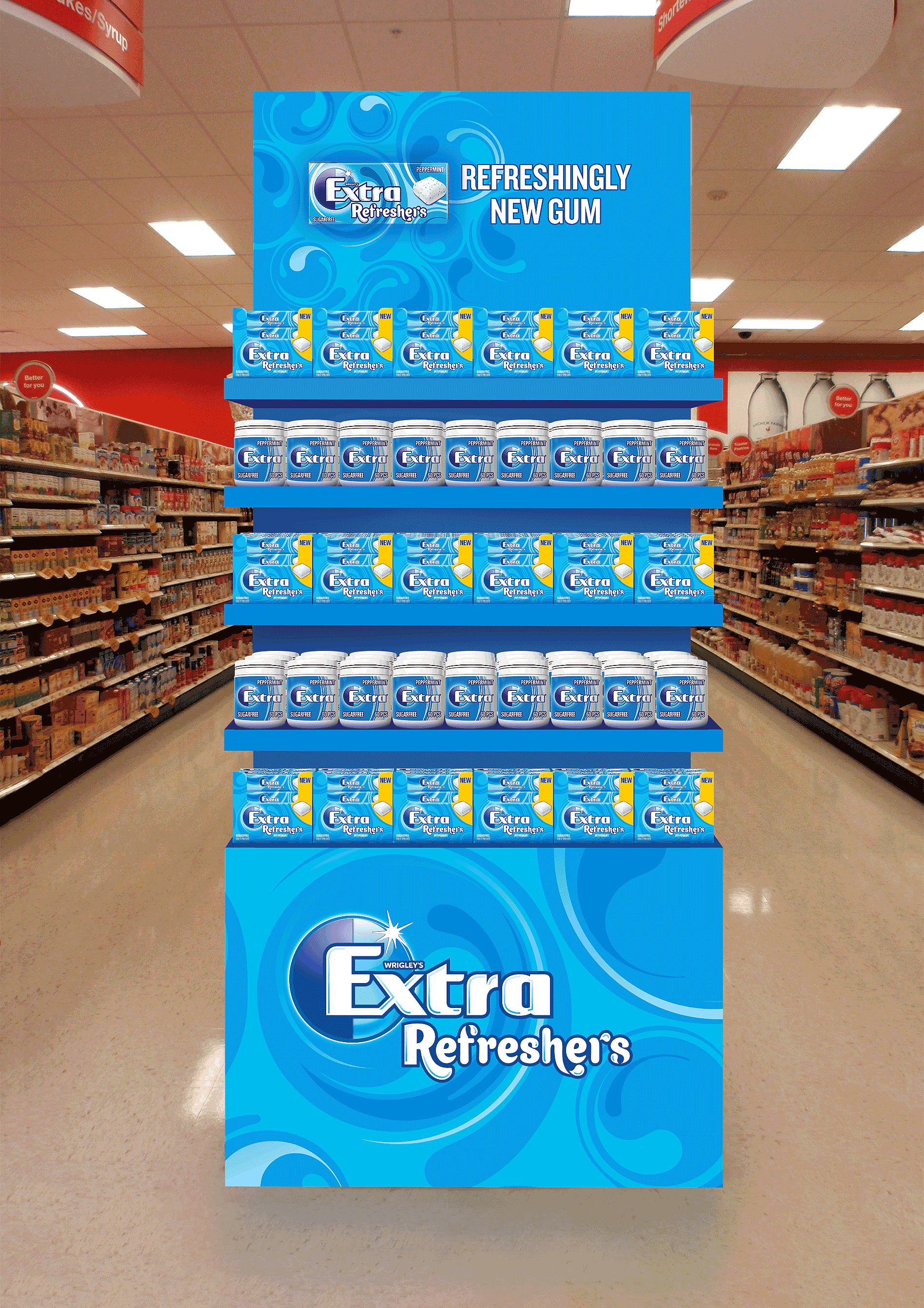
We developed internal launch materials and a cohesive brand toolkit to support the brand and customer marketing teams during the launch, plus an animation to bring the Extra Refreshers product experience to life.
Straight Forward isn’t just a branding agency that delivers great stuff — they’re true partners, and they made this project so special for us. The work far exceeded our expectations — the brand design is beautiful, and the work that went on behind the scenes was the start of a priceless collaboration between us and Straight Forward. Thanks team — onwards to the next adventure!