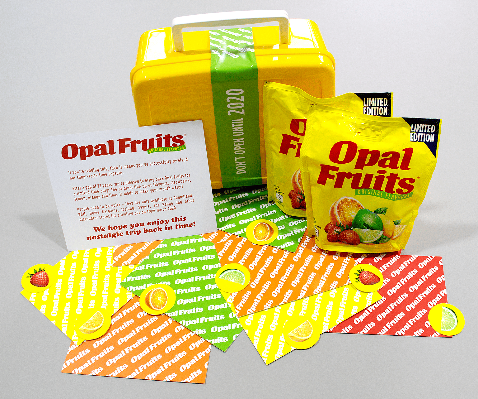
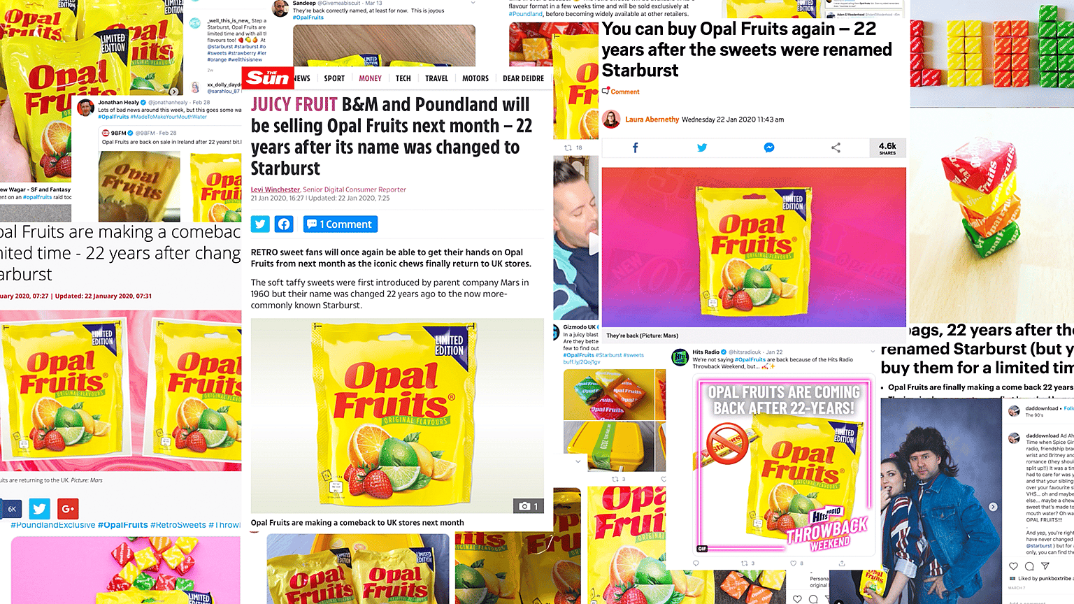
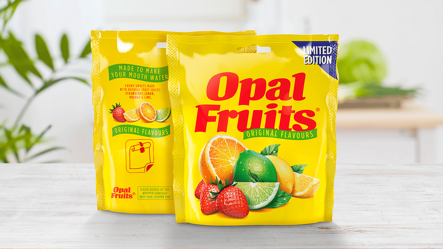
For the first time in more than 22 years, Opal Fruits were going to be back on the supermarket shelves. We were tasked with developing a nostalgic redesign that would get mouths watering.
We needed to deliver a brand identity refresh that was contemporary enough to appeal to new customers, but close enough to the original Opal Fruits to satisfy the original fans, who’d been campaigning on social media for the retro sweet’s return.
Solution
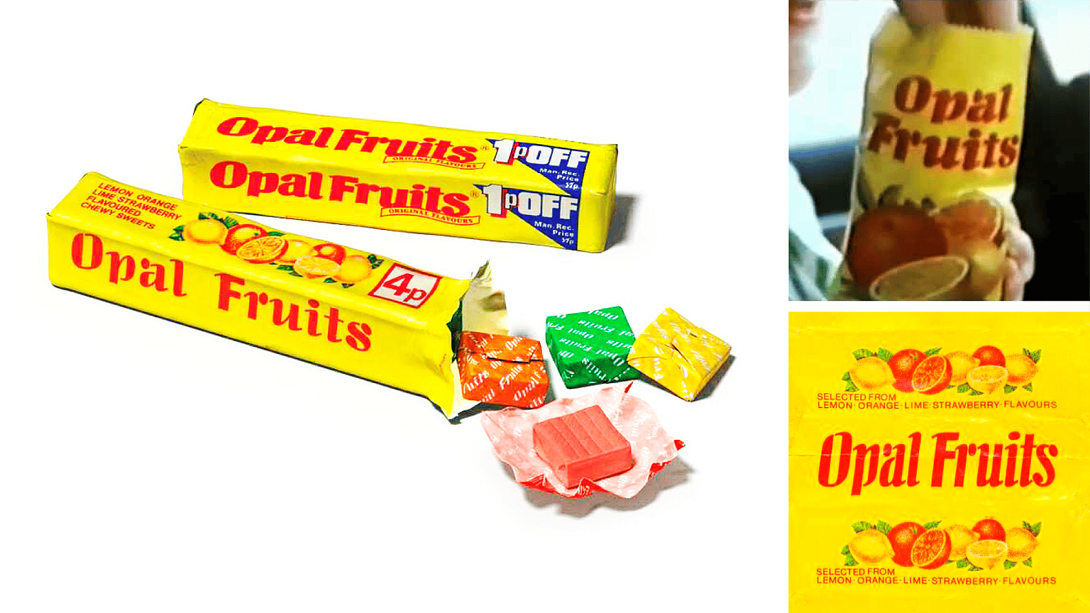
We wanted to honour the original UK brand identity that helped Opal Fruits become such a household name back in the seventies. We collaborated with typographer David Bateman and illustrator Simon Critchley, who’ve both worked with the world’s top FMCG brands for over 35 years.
To get the design absolutely right, we got stuck into the Opal Fruits archive. There were no master designs to work from, so we took our inspiration from the TV commercials, print ads, and — most importantly — the memories of those who enjoyed Opal Fruits back in the day.
Straight Forward Design totally understands how important retro brands are to people and that it requires a special, nuanced approach to get it right. This new design has generated a huge amount of excitement, and has taken Opal Fruits fans on a fun and emotional journey back in time.
Fruity confections UK portfolio director, Mars Wrigley