Play-Doh is one of those rare brands that lives in our memories – and in our hands. But while the original squishy icon hadn’t lost its magic, the brand had started to feel lost. Competitors were closing in, the range lacked clarity, and a new generation of parents and kids needed something more inspiring.
Play-Doh knew it was time to evolve – not just how it looked, but what it stood for. To reframe itself as the champion of creativity, confidence, and individuality. A brand that doesn’t just spark imagination – it shapes it.
Solution
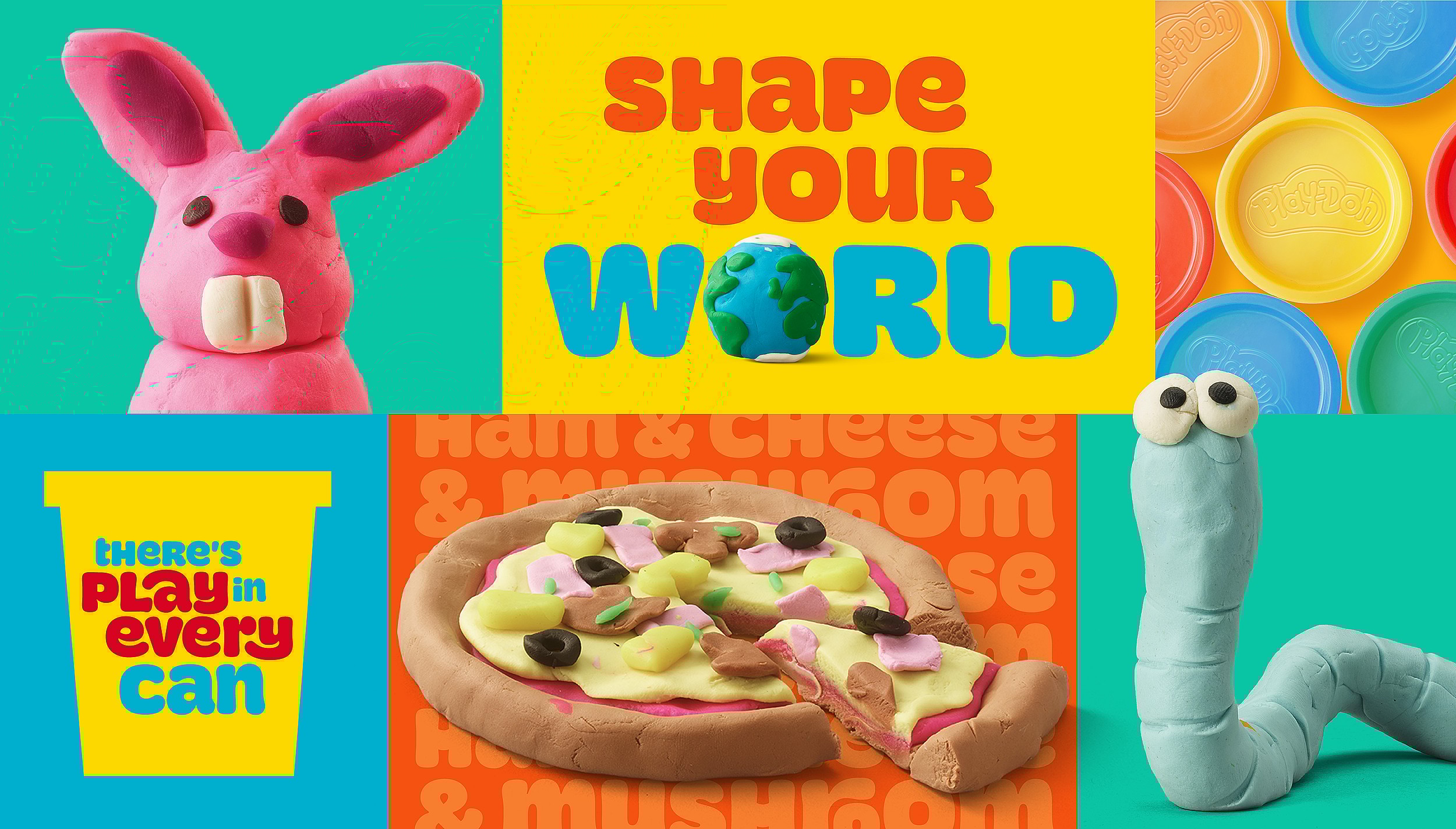
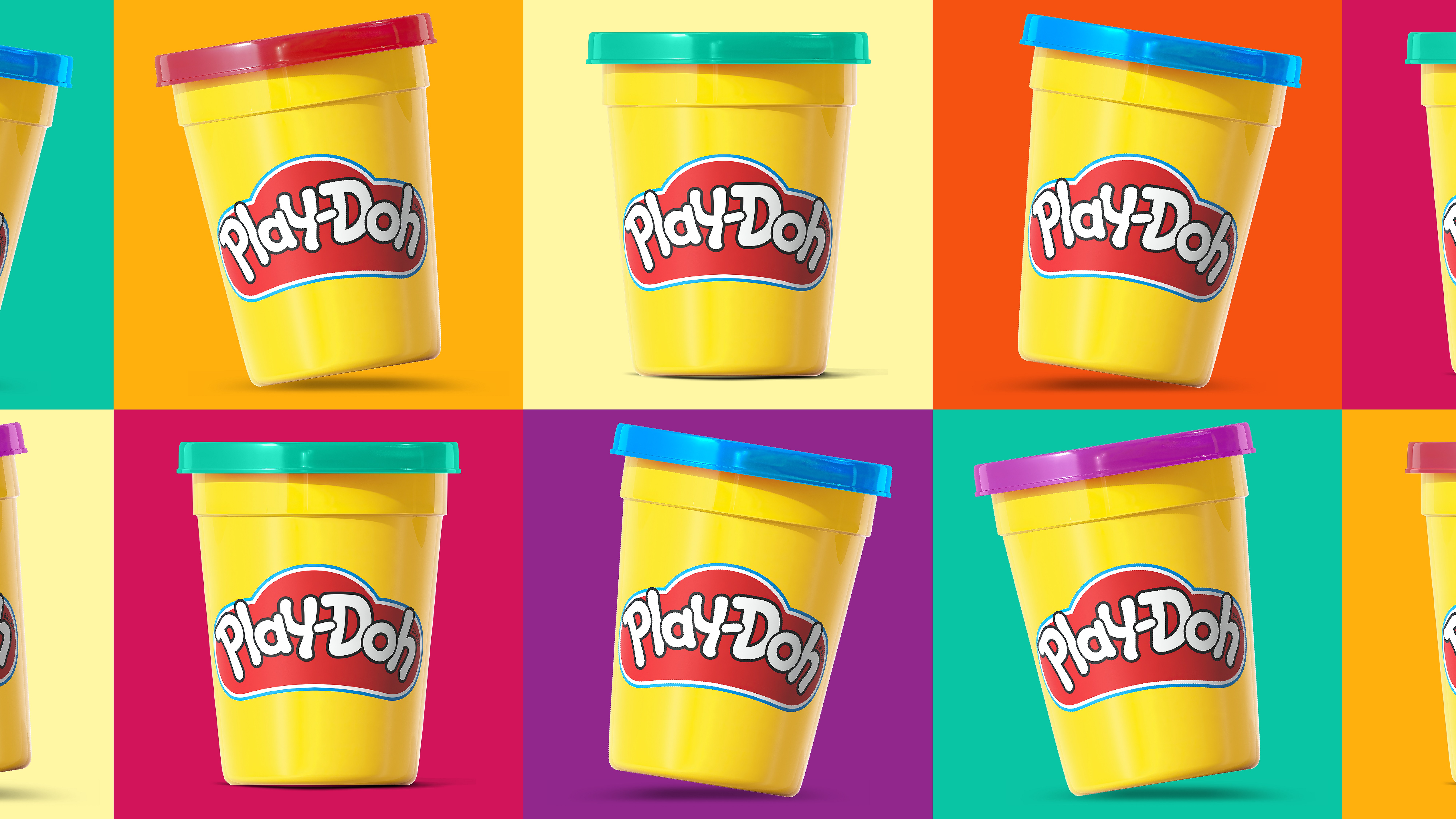
Working In partnership with the Play-Doh design team, we built a vibrant new brand world – one that feels fresh, empowering, and true to what makes Play-Doh special.
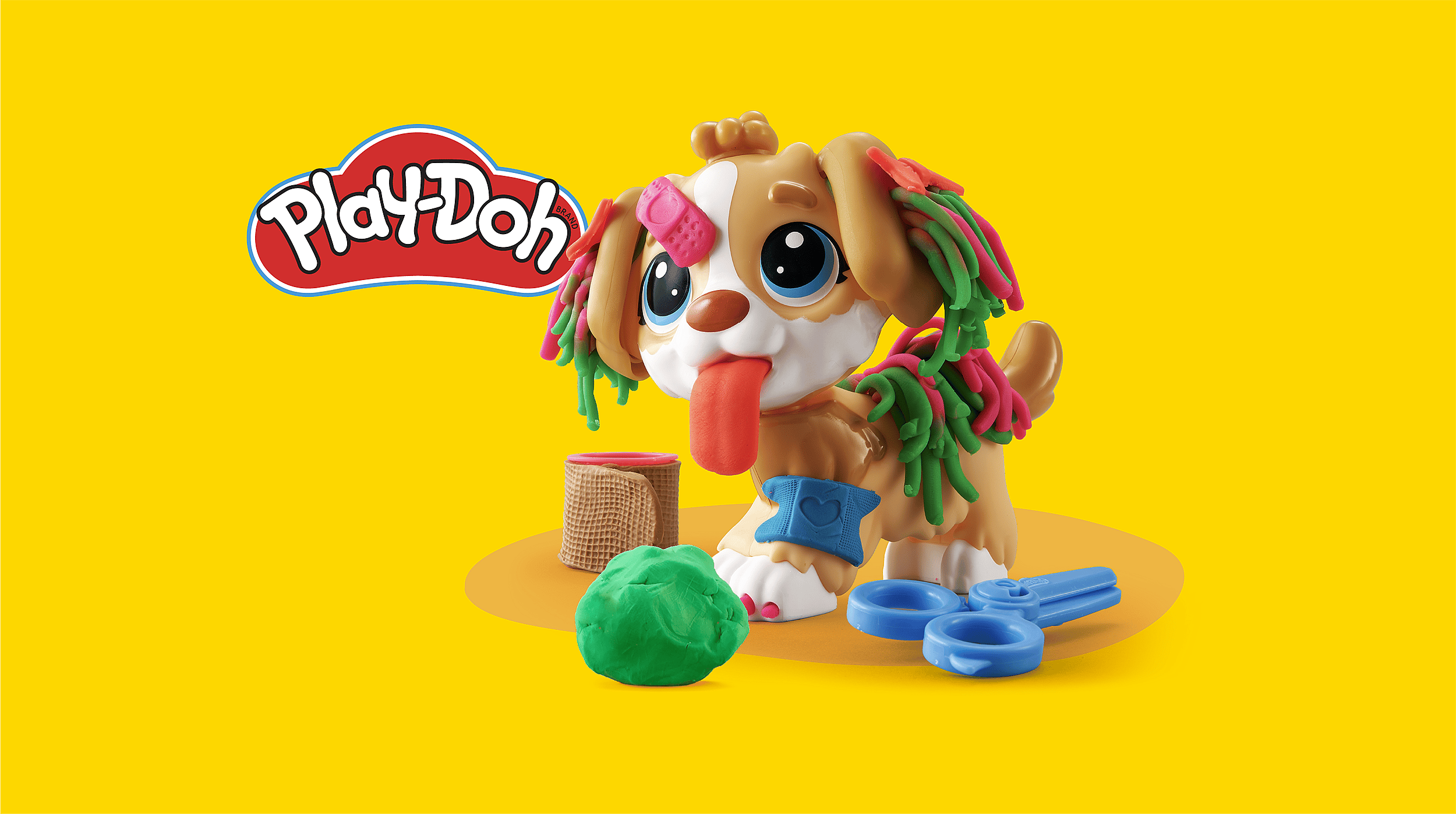
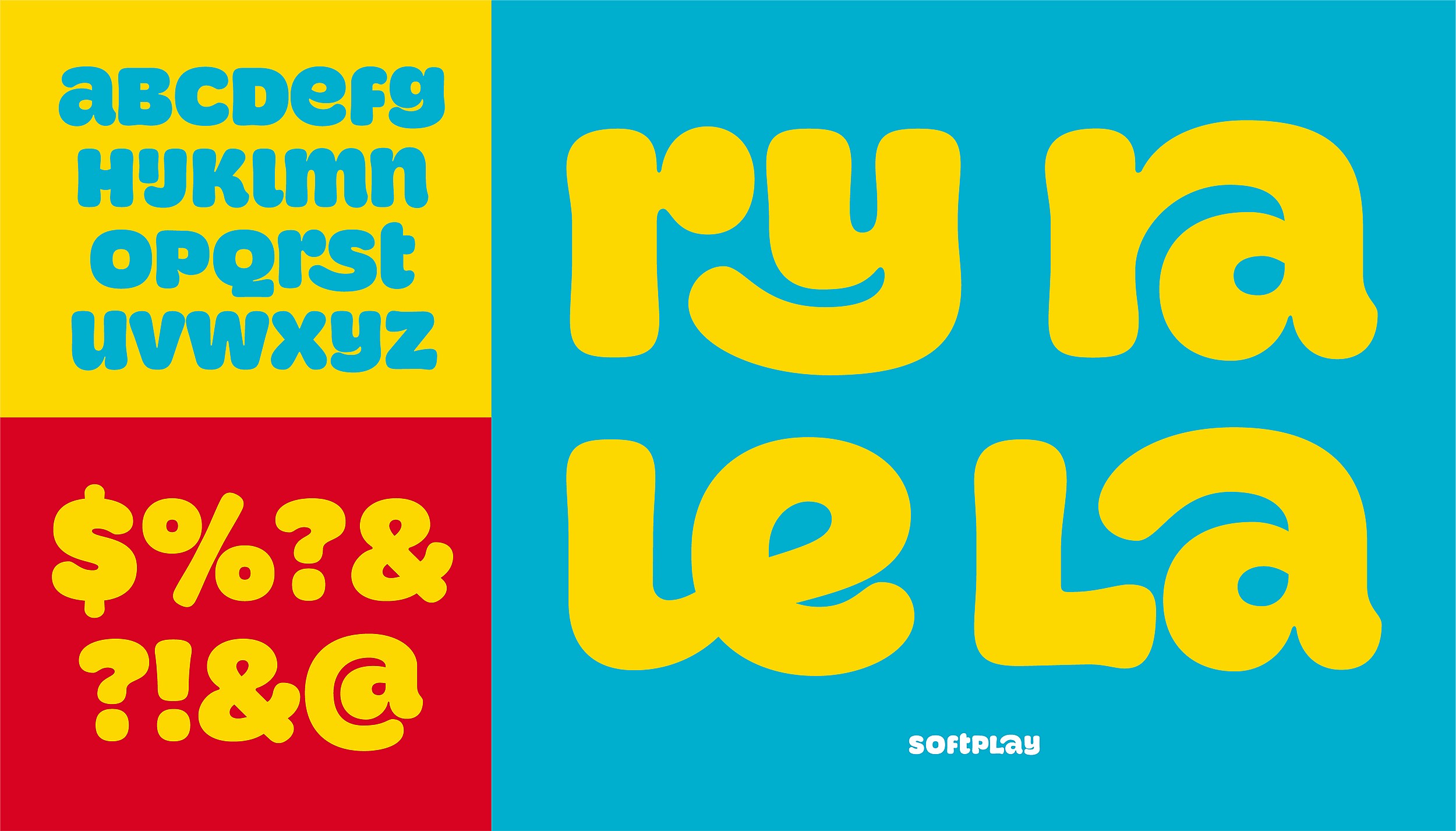
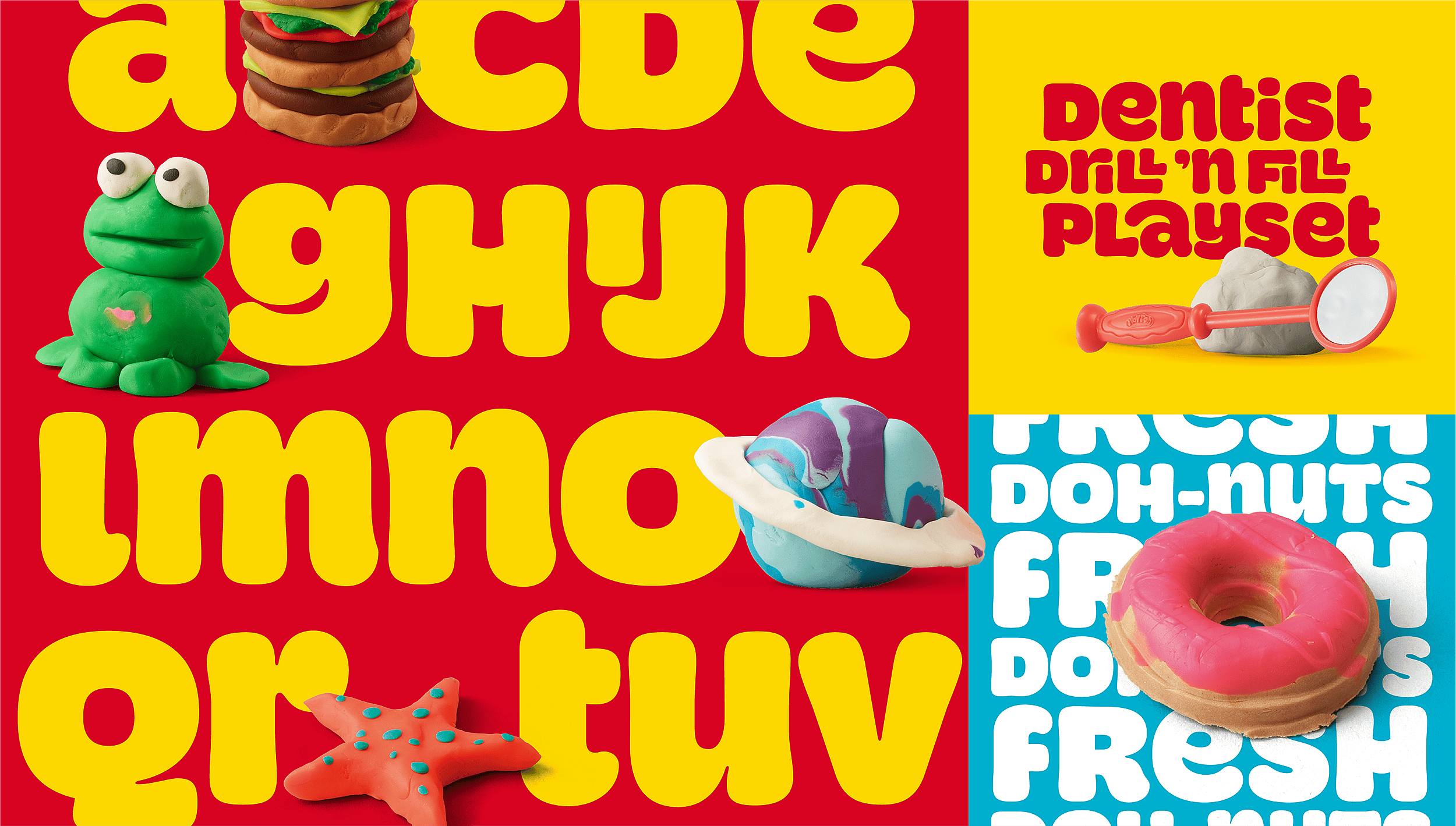
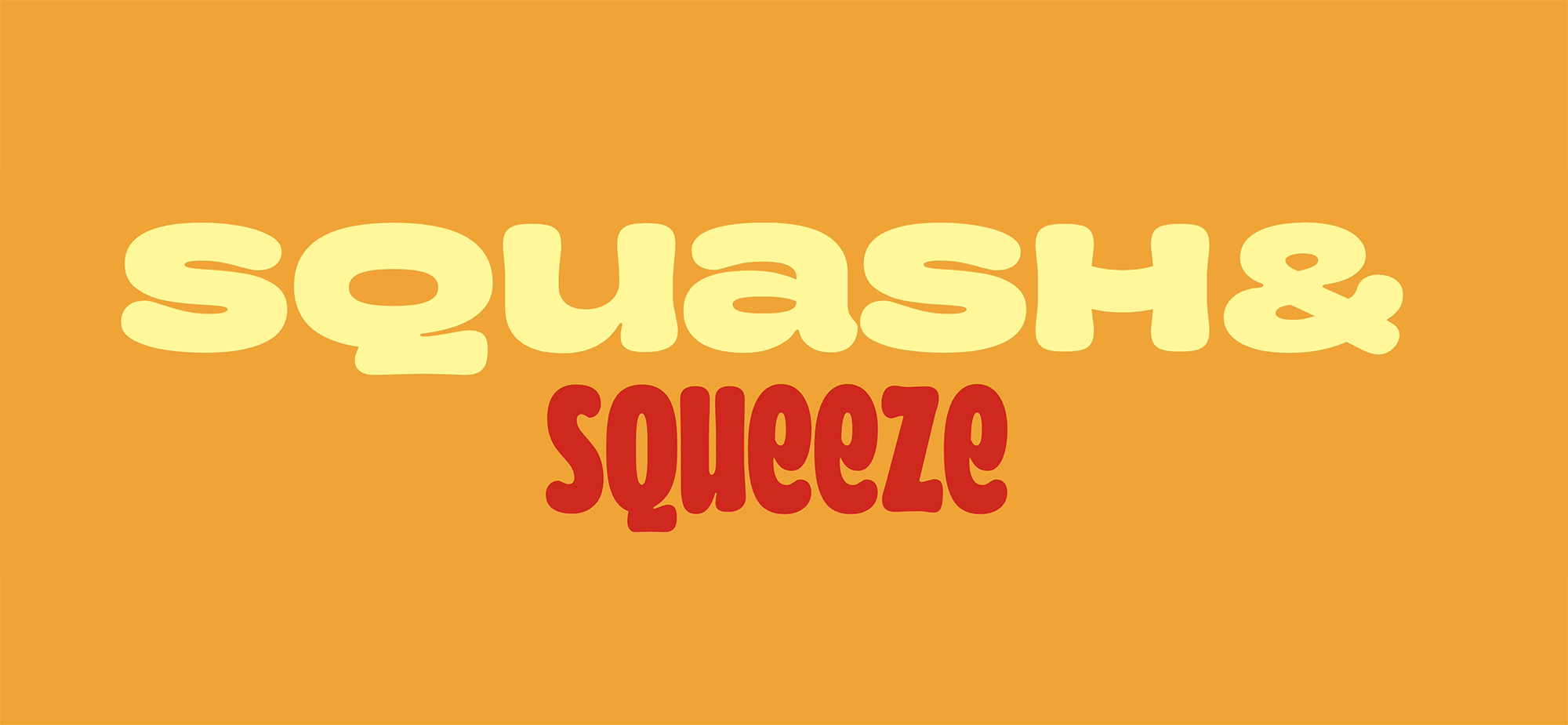
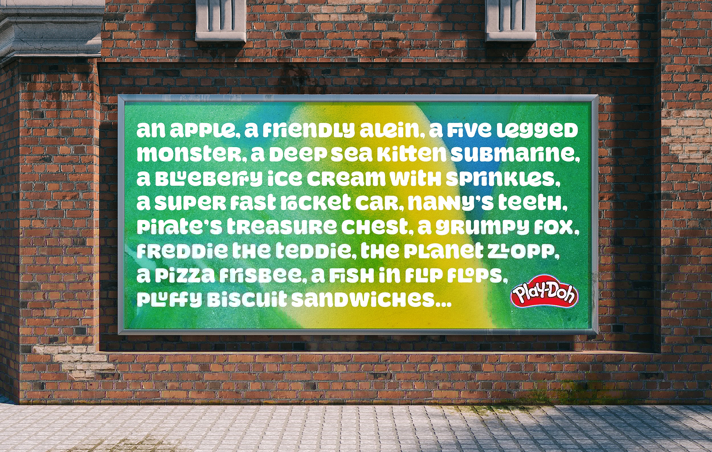
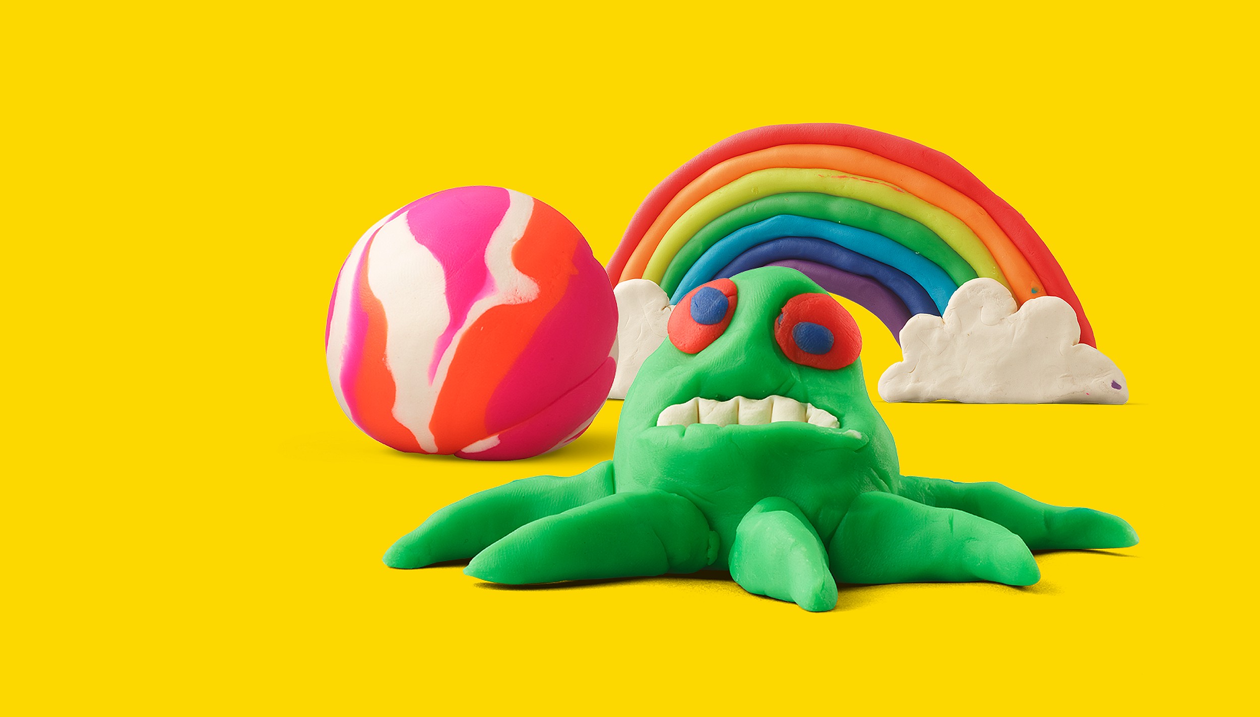
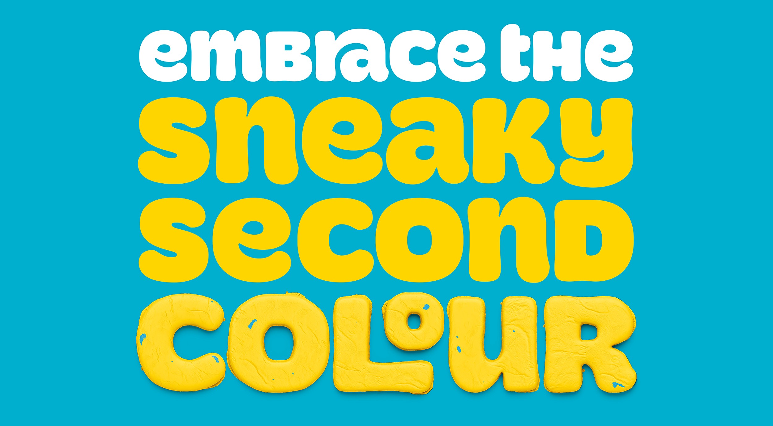
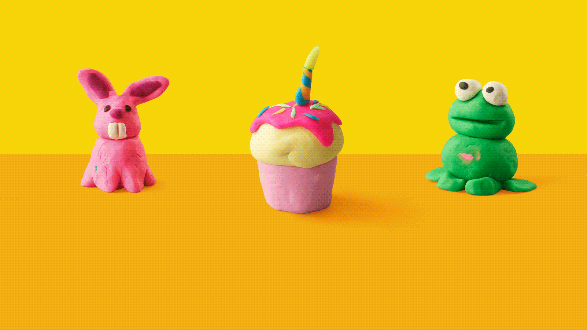
We created a custom typeface inspired by the joyful tactility of the product. A voice full of playful sounds and squishes, gave the iconic colours more purpose. And imagery that celebrates imperfections – because fingerprints and smudges are part of the fun. This isn’t a toy made by a company. It’s a tool for kids to make their mark on the world.
The Result
A brand identity with heart – and hands. Proudly messy, unmistakably Play-Doh, and made to empower the next generation of creators.
Thank you to the Straight Forward team for your responsiveness and inspiration you provided. Your creative solutions took us to the next level and enabled us to see an exciting future across all dimensions.